


TRIANA CACAO
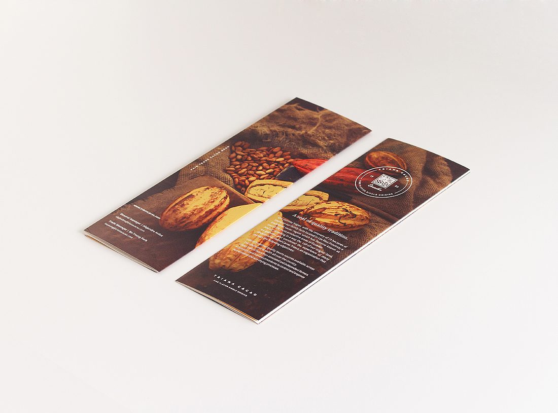
Our journey began with the recovery of 10 hectares of cocoa on our family farm located in Los Rios Province; a traditional cacao region which has become known as one of the most productive areas of Ecuador. And so, attending in a way the call of our origins’ land, we gathered and combined the experience of many decades and created Cacao Triana.
트리아나카카오 프로젝트는 에콰도르 Los Rios주에 위치한 10헥타르의 가족 농장을 재발견하고 재건설 하면서 시작되었습니다. 이곳은 에콰도르에서도 전통적이고 가장 풍미있는 카카오를 생산적으로 재배하는 곳으로 잘 알려져 있습니다. 그렇기 때문에 전 세계적으로 많은 호응을 얻고 있고 수요 또한 많아지고 있습니다. 이러한 상황에서 60년이 넘는 노하우를 살려 트리아나카카오를 재창조 하였습니다.
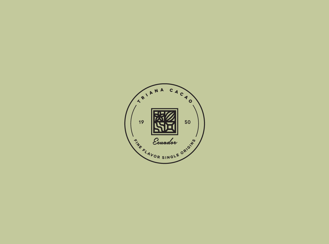
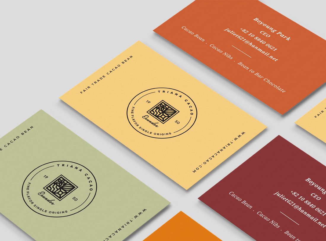
1950년부터 시작된 카카오빈 생산 역사와 전통을 표현하고 트리아나 브랜드 이미지를 확고히 하기 위해 브랜드 디자인이 진행되었습니다. 세계적으로 수요가 높아지고 있는 빈투바초콜릿을 위한 카카오빈 공급 및 자체 초콜릿브랜드를 위해 전통과 트렌드가 공존하는데 중점을 두었으며, 자체 브랜드 패키지를 위해 활용성을 고민하였습니다. 엠블럼 중심을 장식하는 심볼마크에는 4개의 상징성이 반영되었는데 각각 카카오빈의 꽃, 카카오빈, 3개의 강(TRIANA), 전통 가옥을 상징합니다. 트리아나카카오의 브랜드 색상은은 트리아나카카오에서 생산되는 카카오빈의 색상에서 모티브를 얻었습니다.
Client
TRIANA
Creative Director
PLUSMINUS20
Date
2017. 02
Category
Brand Identity, Design, Directing, Logo, Promotion